INDUSTRY:
Humanitarian
CLIENT:
All Hands and Hearts (proposed)
YEAR:
2025
EXPERIENCE:
UXUI design

Fundraising in the Field: Design for Disaster Relief Volunteers
The challenge: fundraising in the field
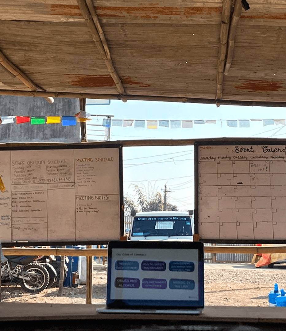
In late 2024, I volunteered with All Hands and Hearts to build their 30th school in post-earthquake Nepal. While on-site in remote conditions, I encountered significant friction with the organization's fundraising platform—a critical tool for volunteers to amplify donations through our personal networks. These UX issues directly affected All Hands and Hearts' mission funding. Even a small improvement in conversion rate could translate to thousands of additional Substantial funding for the construction projects.
Key problems:
Limited connectivity: Managing fundraising pages from remote locations with unstable internet and primarily relying on mobile access.
Donor friction: The existing donation flow created unnecessary barriers from navigation to payment, leading to drop-out
Content creation barriers: Posting project updates was cumbersome and often fail, which is crucial for donor engagement.
This project also presented a dual challenge: designing an ideal solution while acknowledging the constraints of working with a third-party B2B fundraising platform. I approached it as both:
A UX designer creating an ideal experience
A product designer developing pragmatic solutions within technical limitations (in Next steps)
UXUI issues
Excessive information or mini features preventing users from doing intended tasks
Responsiveness
Unclear navigation is hindering users from managing or viewing the page
Limitations on editing and performance during the update posting

solution.
My redesign focused on the following 2 critical touchpoints that impact the fundraising success:
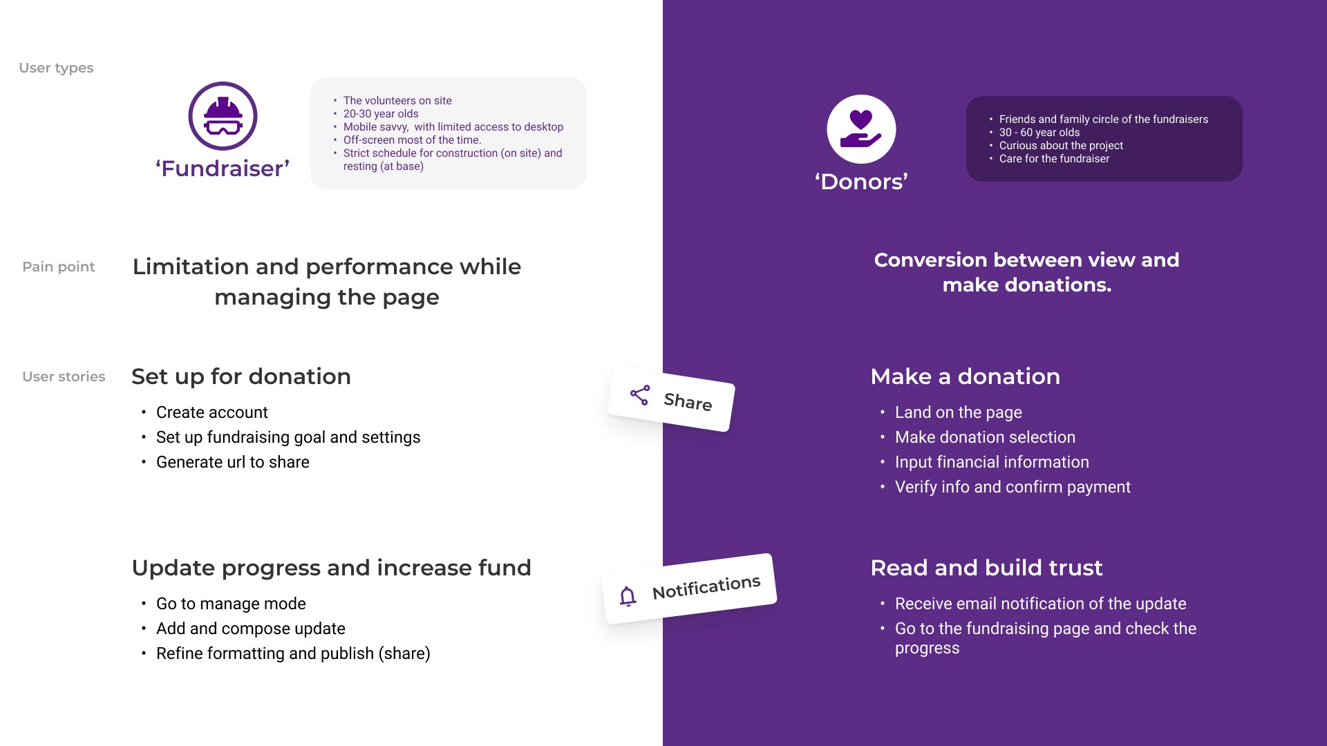
1. Page Overview (pre-donation flow, donor journey):
Simplified and structured information hierarchy prioritizing with a donation widget
Easy to browse Updates
Mobile-optimized layout
2. Fundraiser Management (Initial page set-up, content management volunteer journey):
Simplified functionality to key activities, setup and post updates.
structured settings hierarchy as the ‘Manage mode’, distinct from ‘View mode’
One-tap sharing functionality for social amplification


next steps.
To move forward with implementation as the ‘Next steps’ as the potential role of product designer, I would approach the three parallel workstreams:
User Testing: Validate design solutions
Assess vendor constraints: Document technical limitations of the current B2B platform to identify feasible short-term improvements
Mobile-First Alternative Research: Evaluate emerging fundraising platforms with stronger mobile capabilities for potential long-term migration